Rosemont Web Refresh Project
A redesigned user experience and content strategy for Rosemont College.
- Category: UX and UI Design, Content Strategy, Information Architecture, Frontend Web Development, SEO
- Client: Rosemont College
- Role: Director of UX and Content Strategy, Front-End Developer
- Skills Used: UX wireframing, XML/XSL, Figma, usability testing, UI design, UX writing, HTML/CSS, JavaScript, SEMRush, Bootstrap, user flows.
- Goals Achieved: Functional and user-friendly website upgraded sitemap, navigation, user flows, upgraded UI design and layout, upgraded site responsiveness.
Context and Challenge
Rosemont College is a small liberal arts college located on the Main Line of Philadelphia. Offering bachelor and master's degrees, the school focuses on delivering a high-quality private education to any student with promise, regardless of their financial resources.
Prior to my start, the website and general digital presence had no governance, weak SEO, an inconsistent voice, and chaotic information architecture. As a small organization, coming into this role and project meant that much of the project lay on my shoulders, with limited assistance.
I was tasked with managing the project, designing and implementing new web assets and layouts, and conducting a content audit.
All components of the project were carried out to add to the launch of a newly-optimized and userfriendly website. PS&L contributed to the project as a third-party vendor.
Site Health, UX, and SEO Improvements
The following report displays the dramatic and positive change in site health. These improvements included fixing broken links, reducing duplicate content, implementing standards of WCAG web accessibility, and creating/implementing brand standards. These stats are generated from SEMRush.com.
- Overall site health doubled from 40 to 80, higher than industry standard for websites in the education sector.
- 28% increase in users, 32% increase in new users, 10% increase in overall sessions after project (measured in GA).
- Near total elimination of broken pages, including removing broken links, removing duplicate content, and streamlining IA.
Information Architecture and User Flows
Before delving into active revisions and optimizations, we laid out the ideal information architecture to make navigation more aligned with our users' needs. The ensuing collaboration resulted in the following sitemap and user flows.
A content audit was performed, highlighting all the current errors and areas to improve upon. A selection of the documents produced during this phase are included below. P,S&L assisted with this phase.
Homepage Design and Implementation
this phase of the project, I created wireframes, prototypes, worked with third-party vendors, and collaborated on frontend development to make sure our technical launch and aesthetic needs were met and exceeded.
After collecting the technical specifications from stakeholders in the project, I drew wireframes of the new layout, then drafted prototypes with color and detail.
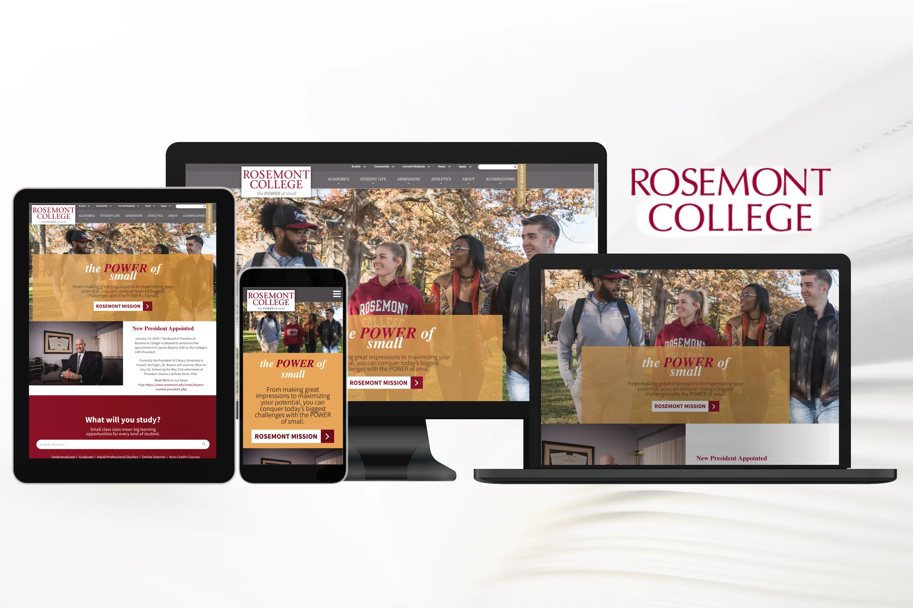
Then, in collaboration with Omni CMS, we brought the new designs to life with HTML/CSS, JavaScript, and XML/XSL. A primary focus of the redesign was to make sure that it was responsive and compliant with WCAG standards of accessibility. The revised homepage is responsive and accessible on mobile, tablet, laptop, and desktop screen sizes.

Brand Style Guide
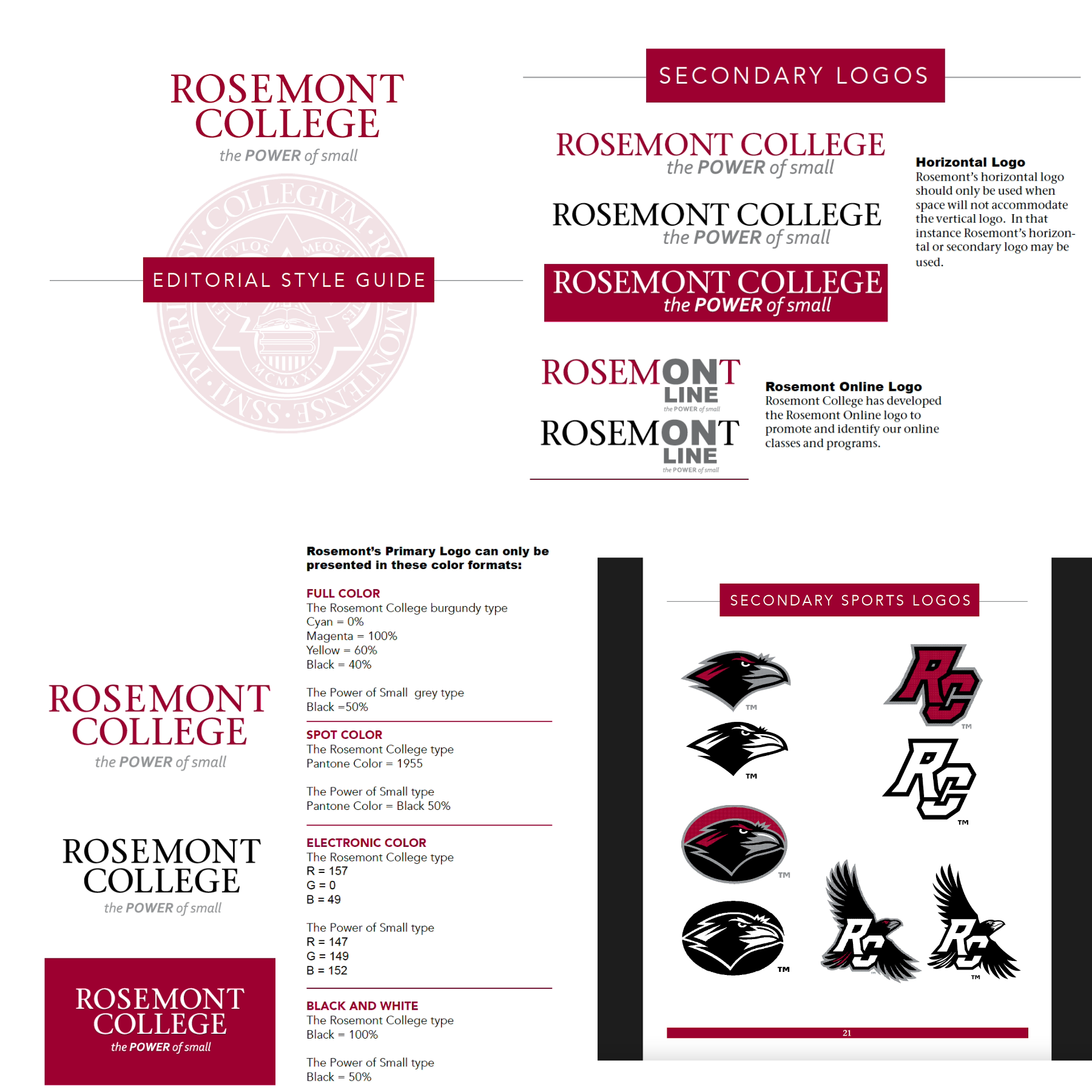
View BrandbookDeveloping a consistent brand starts with creating a brand style guide. These branding rule books help graphic designers, marketers, web developers, and community managers all stay on the same page, and present a unified vision.
In collaboration with our Graphic Designer, we drafted this working document to address the use of the logo, colors, writing conventions, and typography for the organization. This ultimately led to greater understanding and cohesion across digital and print properties.

UI Design and Components
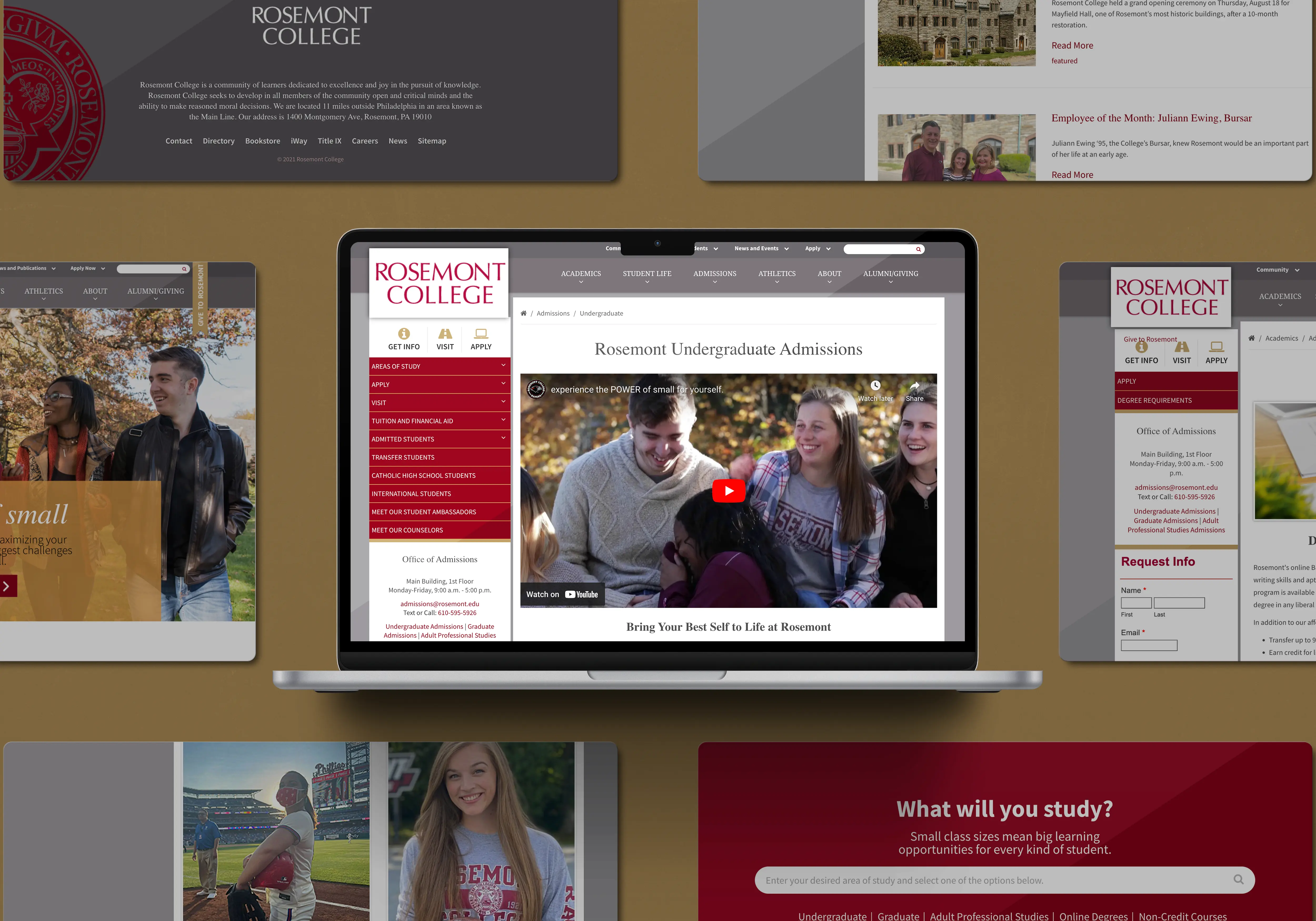
To make the website branding and user experience more cohesive, I designed web assets/components using html/css, Bootstrap, JavaScript, and XSL/XML to match our new color webpage layouts and color pallete.
I used these new UI components to showcase testimonials, programs, CTAs, and other featured pieces of information. Calling out specific pieces of information and crating clear and user-friendly navigation markers eliminated the tendency to clutter up and improvise content design decisions.